Power BI (Introduction)
Power BI
------->Once we open the power BI the first Image is like below.
------>Then we need to click on Get started.

Provide, meanwhile, click on Cancel.

---->Then click on Get Data, We can see here power BI is integrated(connected) to so many data sources.


------> Depending on the data source we can get the data like EXCEL, CSV, PDF, JSON, etc...
------->If the data source is an excel sheet, we can click the Import data from Excel, Once click
on this directly it will go to the file location like below.

------->Then we need to select the file and click on open like below.

------->Then we can see the data below.

-------->If we open the two-time Excel sheet from the source it will assign names like below1,2,3

-------->Remove the duplicates like Right Click on the table which table you want to delete.

------>Then select(✔) on all the three tables like below.
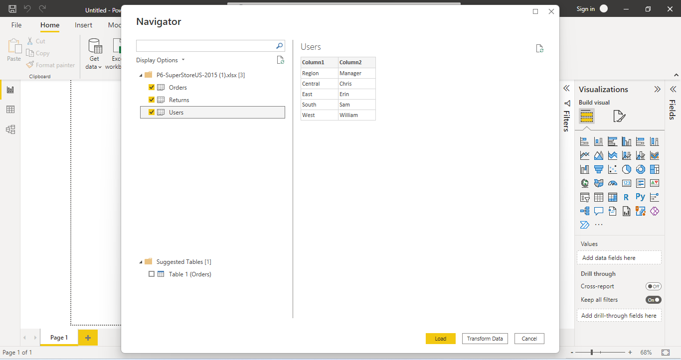
------>Under the bottom right corner, we can see two options Load, Transform Data
------->First step we need to click on Transform Data
------->whenever we are received data from the client we need to identify it.
1)what columns are we having the data in?
2)What is the data type?
------>That's why we are not directly loaded the data.
------->Once we clicked on the Transform Data we can see an image like below.
------->If we click on any table in the left top corner the table details are able to show like below.
-------->We can check below what are the data types, we can see below and what the data exactly.
1)ABC---means -Varchar (or) String Data types
2)123----means ---Integer Data type
3)1.2-----means ----Decimal Data type

--------->We can see below 4)Calendar symbol ----means---Date Format.

-------->We can see below 5)ABC 123 symbol ----means ---for null column.

.png)
------>Then click on Close&Apply, we can see the below.

------->Once you click on Close &Apply at the left side top corner, we can see the below images it will try to load the data.
.png)
.png)


2)Data View:-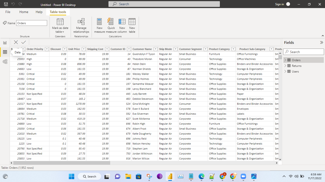
3)Model View:-


------->Once you click on Close &Apply at the left side top corner, we can see the below images it will try to load the data.
-------->We can absorb the pop-ups like a load below.
.png)
.png)
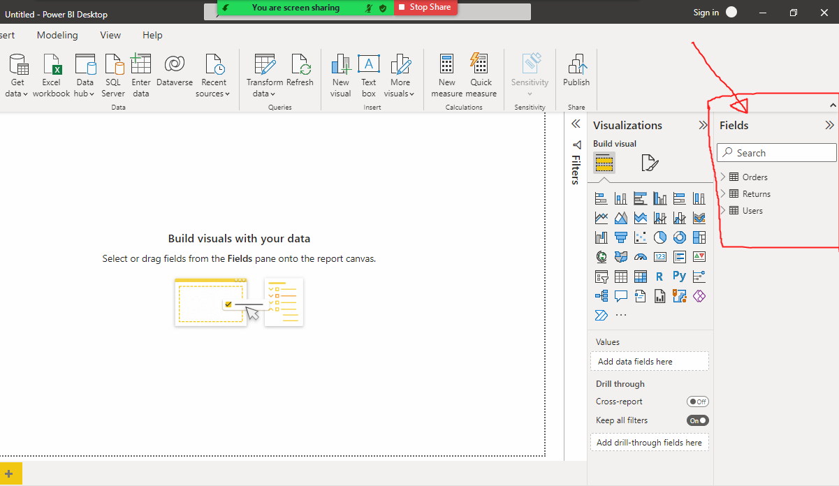
------>All the tables which are loaded from the Excel sheet under the fields can see in the below.
----->The below image about Canvas means(Visualizaion Area).
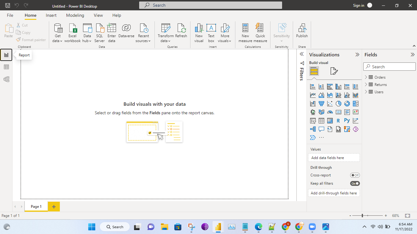
------>Three View we can get in Power BI Report View, Data View, and Model View.
1)Report View:(Right now there is no visual)
2)Data View:-
3)Model View:-
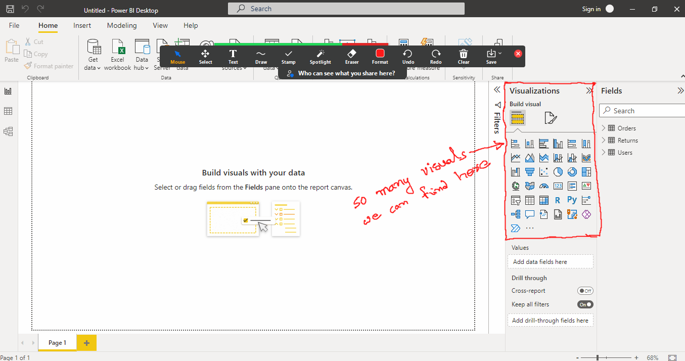
----->The below image about Visualization area(we can find so many visuals find here).
------->We can expand the columns in the tables in the Fields.
----->We can see all the Visual names like below in the Visualization Area.
------>We have so many visuals out of that we are using like bar chart,donut chart,line graph most of the comman things we are using in real time.
------>But always explore much more make your visualization better.
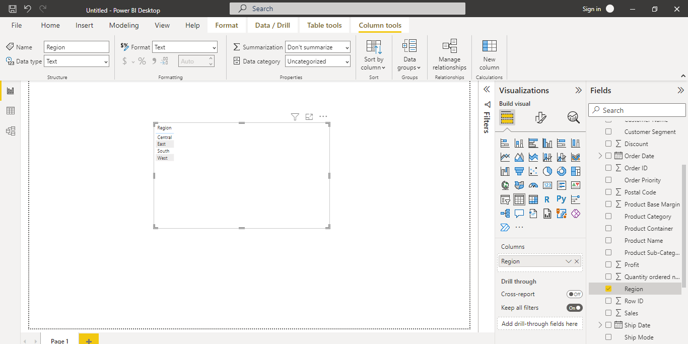
Ex:-1(Just we are using How Table Visual looking like):-
------>Table visual like below.
------->After select the visual we can get the visulization area like below.
------->Select region on the table columns then we will get the image like below.
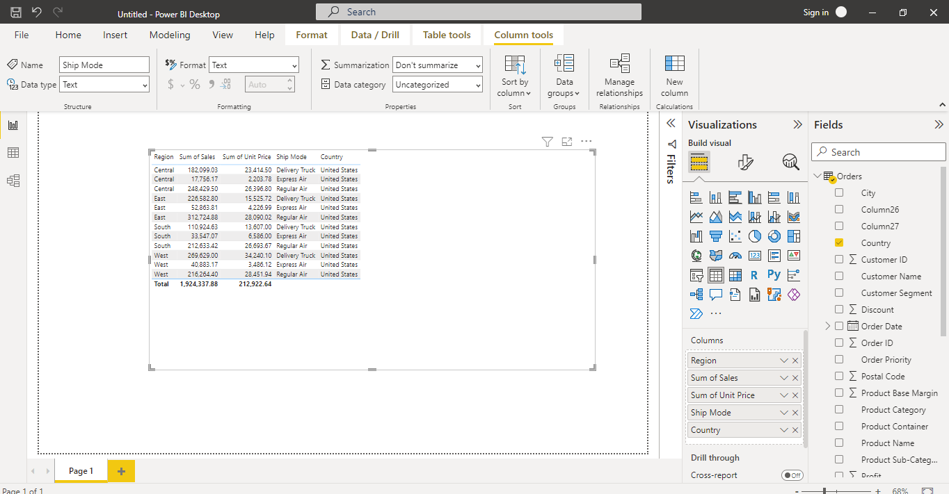
-------->Suppoce region wise I want see the sum of sales.
-------->Region wise I want see Including unit price,Shipment_Mode,Country also.
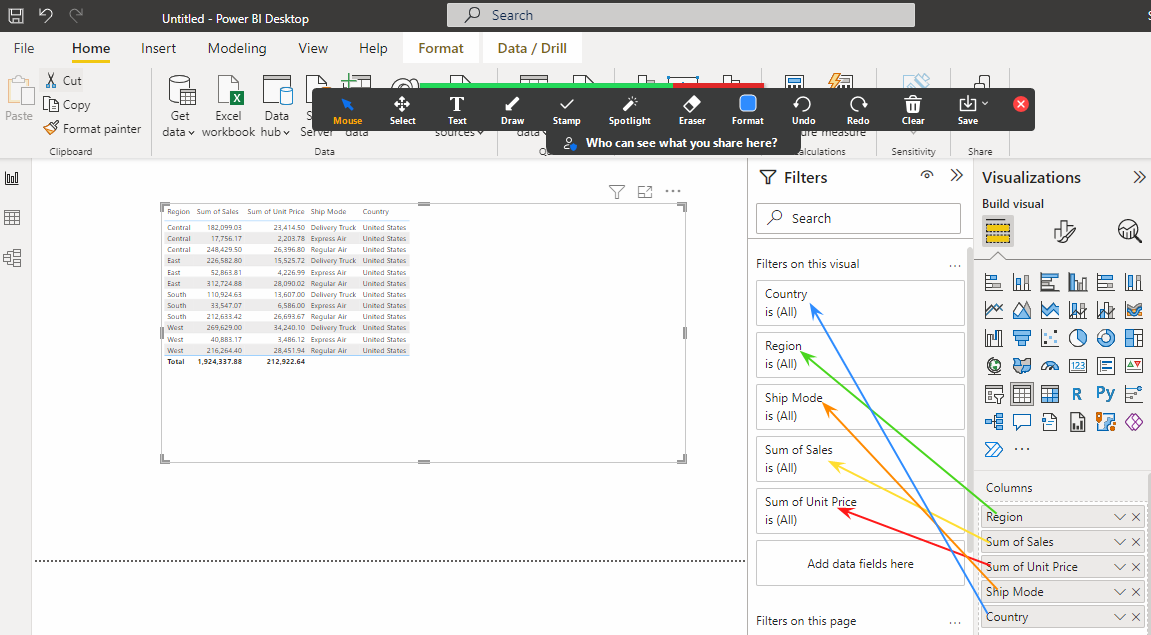
------->Whatever colmns you are added it will automatically go to the Filters also like below.
------->The above visual(Table) does't looking good to showcase to the client.
-------->The visual like below it is looking good to showcase to the client.
------>The above visual is looking to Understand the client Top 3 Performers from Region Wise.
------->Because of that we are choosing different type of visulizations to unterstand how the business looking.


Comments
Post a Comment