Power BI-Time Series Data Visualization-Line Chart,Slicer,Card Visuals
Line Chart


------>It is the not best way to showcase Unemployment, We need to take the average, like below,

----->We can find the dropdown arrow option below,
------>Here We need to choose the Average option to get the proper Visual.

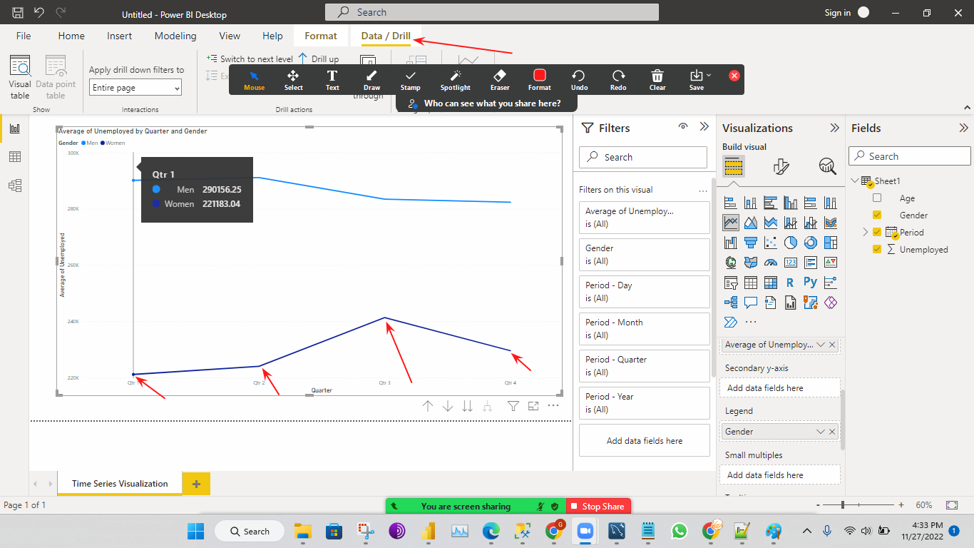
------>Now we are adding the column Gender to the Legend, Now we can get two lines (men, women) from the Chart like below, Now the dataset has been bifurcated.
------->We are going granular(digging down (or) going inside) wise like inside Year Quarters, Inside Quarters Months, Inside Months Weeks, Inside Weeks Days.

----->For that Granular level, we are using the DATA/DRILL option like the below Visuals
1)If I click Switch to the next level the Visual will show Quarter-wise across all the 10 Years like below (2005,06,07,2019.) example(Jan,Feb, March of 2005, Jan, Feb, March of 2006 in Q1, etc..,
2)If I click again to Switch to the next level the Visual will show Monthly wise across all the 10 years
like example(Jan 2005,Jan 2006 ....etc., into Jan,Feb 2005,Feb 2006.....etc., into Feb etc..,


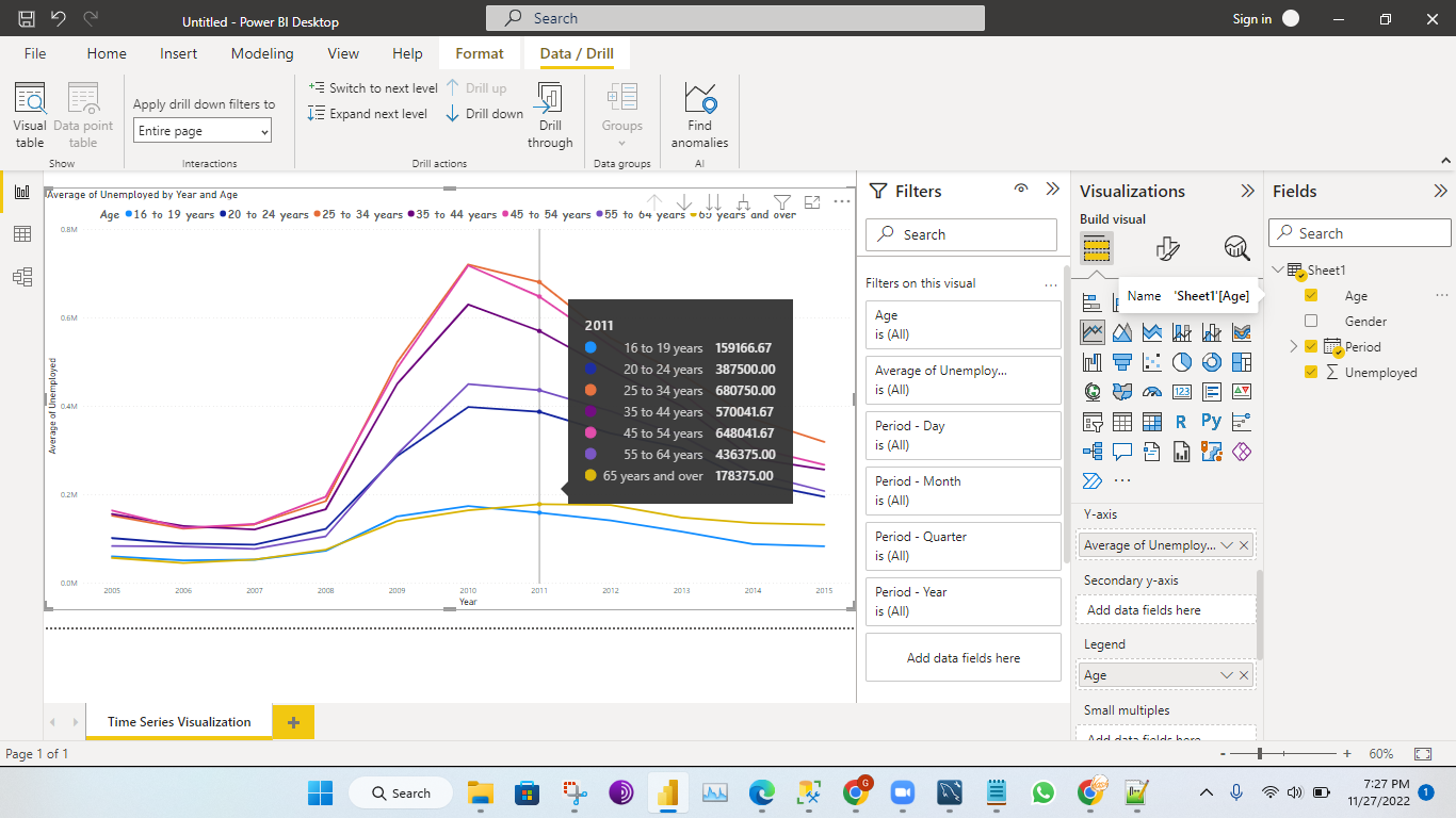
------>Let's Change the legend to age in the Visual below.
Data/drill Option(R&D)
-------->If I click on Expand next level one time the Visual is like the below.
--------->The next level of the year is Quarter bcz of that visual came into the Quarter.
--------->When you Expand next level your horizontal periods get expanded like below.

----->It is a little bit confusing let's change Legend again Gender, We are changing Legend bcz of understanding the Visual purpose and the Visual below.
-------->Can you absorb below your data points are increased?
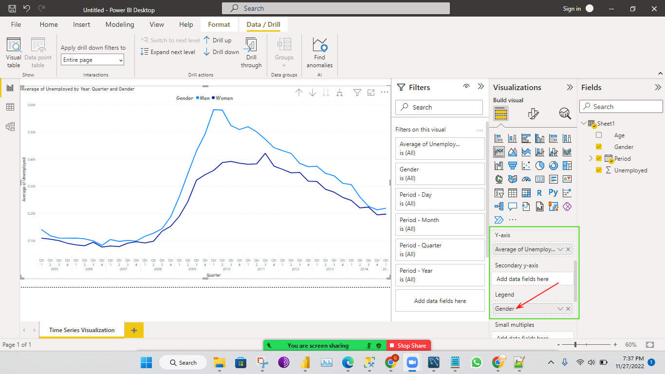
------>Again click on Expand next level, The Visual below will give you all the Quarters, Months how is the trend.
------->Here Visual came to the Monthly-Wise and again data points keep on increasing.

Note:-
------>If the click asked about monthly wise trends then we can use the DATA/DRILL option no need to apply FILTERS.
------>How to Unemployment are there across the country we can use generating using a line chart, This is where the time series concept comes into the picture.
Q)How granularity is done in Power BI?
Ans)Using drill down option in Power BI.
========================================================================
----->Now, the above all are the Visual are line charts, the Visuals are not look good when you showcase into the Visuals(Everything is Intermingle).
Q)What is the best approach when in terms of a line chart?
Ans)Stacked Area Chart. 

 Stacked Area Chart
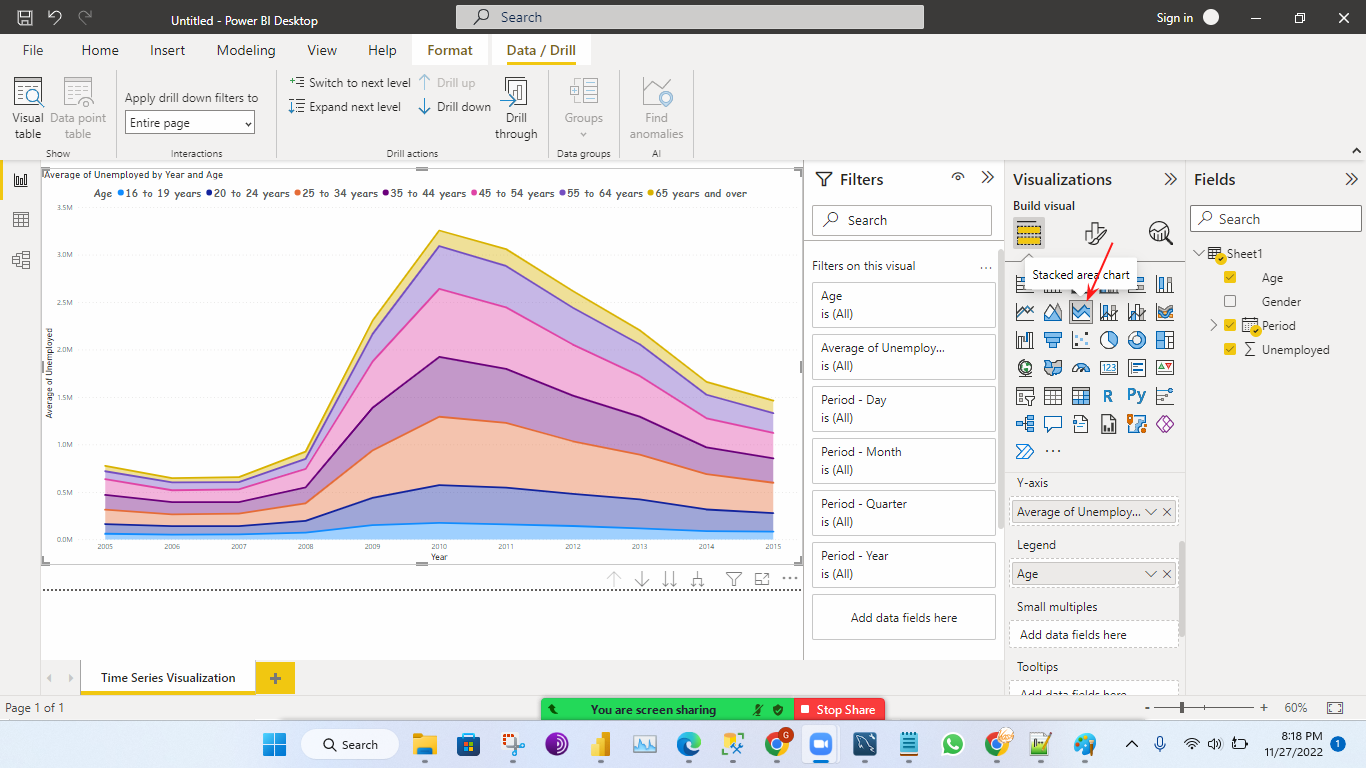


 ---->First you need to deselect the mouse from the existing Visual otherwise Slicer will occupy the


 How to Change Slicer Functionality


 Boarder


Lets Absorb the Differences B/W This Below 3 Charts
Line Chart
Area Chart
------>Upto now we have understood the Visual of a Line Chart.
Q)What is the difference b/w the Area Chart and Stacked Area Chart?
------->Lets's absorb both the differences below.
Stacked Area Chart(Year &Age) Area Chart(Year&Age)


Stacked Area Chart(Year,Quarter&Age) Area Chart(Year,Quarter&Age)
Stacked Area Chart(Year,Quarter,Month&Age) Area Chart(Year,Quarter,Month &Age)
Note:-
----->Can you absorb the Area Chart it's not looking good(We can't recognize what exactly the trend how it's falling it)?
----->From the above Visual we came to the Conclusion the Area Chart does not look good Compared to the Stacked Column Chart.
----->Stacked Area means One above the other.
----->Avg will give the original trend. (use always avg for the Original trend).
Slicer
Slicer
----->If we want to use a filter that appears as a visual in a chart that is called a slicer.
------>slicer is a visualization of a filter.
------>It makes it easy to read.
Q)Diff B/W Filter and Slicer?
----->Functionality wise both are the same.
----->But for Slicer is basically a visualization of the filter.
How to Use the Slicer
---->We can pick the Slicer from the Visualizations like below.
existing Visual like below. Use Ctrl+Z we can go back to your existing Visual
----->That's why we need to deselect the existing Visual then we can select the Slicer like below.
------>Once you select the Slicer then we need to drag Column to the Field like below.
------>After dragging the age column then we can find the down arrow option in the Slicer like below.
------>Once you click on the down arrow option we can get two options like below.
Q)When to use the list? When to use dropdown?
----->List we use when we have more than 5 categories means 5,6 combinations like age.
----->DropDown we use when we have 165 countries.
When you choose the List option the Visual like below.
----->This is there in the form of a list,
--------How List Works--------
------>If the categories are less(like 3 (or) 5 in Age), then we can choose List otherwise we can choose the Drop Down option.
------>If the Category's more, If you choose List option then the list will occupies more Space in the Slicer
Visual.
When you choose Drop Down option the Visual like below.----->This is there in the Form of Drop Down(All).
--------How Drop Down Works--------
------>Suppoce I want select two options at the same time in the Slicer Visual.
------>By Changing the Slicer settings we can get it.
Step:1
------->We need to go inside Slicer Settings then we need to choose Options Under the Options we need to choose Orientation like below.
Stpe:-2
-------->If I select Horizontal under the Orientation option.
-------->Once you click on the Horizontal Boxes will come like below.
Step:-3
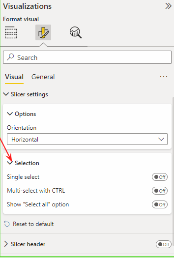
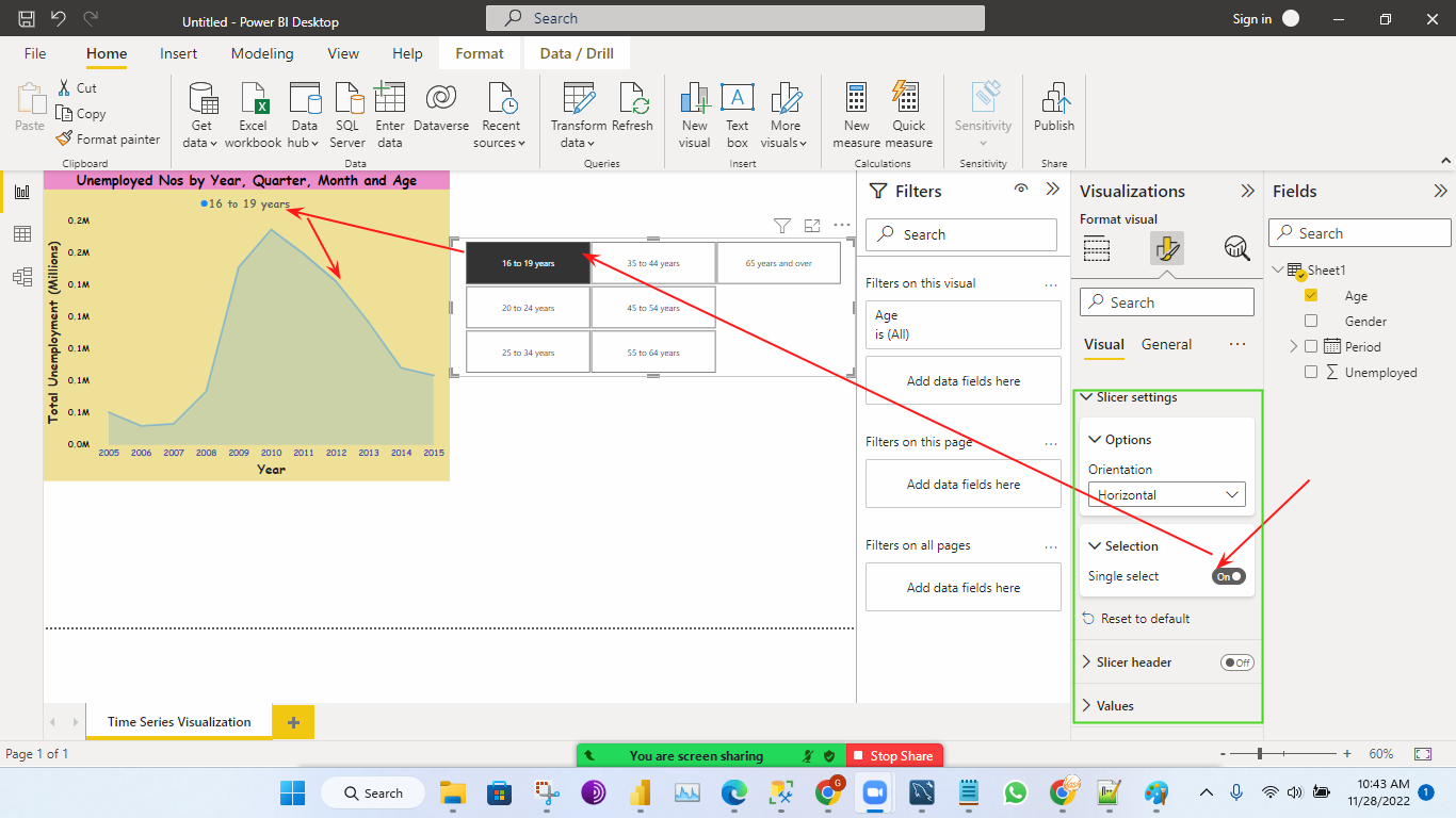
-------->The Very important option in the Slicer is Selection.
--------->Under the Selection option, we can find the 3 options the Visual like below.
1)Single Select
How Single Select Works
------>In this selection we can select only one box at a time like below.
2)Multi-Select With CTRL
How Multi-Select With CTRL Works
------->In this selection we need to hold (or) press the CTRL key button on the keyboard then we can click on the multiple boxes at the same time which you want like the one below.
3)Show "Select all" option
------>In this selection, It's select all the boxes, If you want you can deselect the boxes based on your requirement like below.
Note:
------->Most of the time we are using 3rd option(Show "select all" option), Bcz it is very easy for the client also even if they don't know the Power BI.
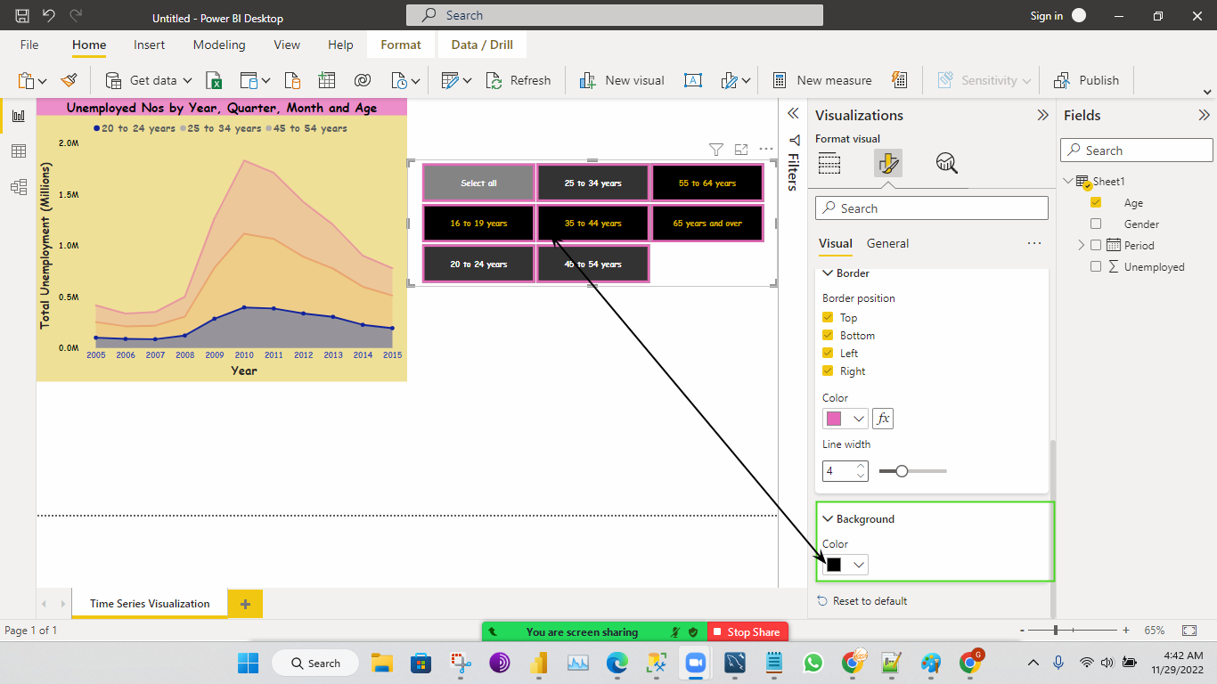
------->Now we can change the coloring of the Visual, Font size, and Border colors by using the below options below.
------->We can these options under the Slicer settings.
Values
Background
Slicer Header
----->Show summary means it will select multiple selections like below, as per requirement we can enable to understand easy to the client.
------>In General we can find the different options we change as per your requirement like below.
------>Legend and Slicer don't give a title that is not best practice(or)it's not looking good.
------>I have taken one more Slicer for the Gender purpose similar manner to the above.
------->Final Visual like below.
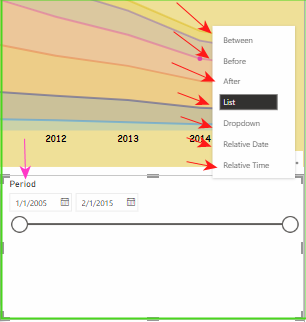
------>Now am taking one more Slicer for the Period.
------>Once I given the period then Slicer was came some different Design like below,In that we can find
some different options like below.
---->We need to check all these options and how it's working.
----->The Final Visual like below with all the Slicers.
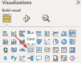
Card
------->We used mostly in the KPI(Keep Performance Indicator)
------->It gives the number, We can find the Card Visual below.
-------->Once you click on the existing Visual to Card Visual, Then it will give the number like below.
------>In this Card Visual, we can change the Visual format like below.
------>If we want rename for the Visual we can rename it like below.
------>Once you click on the Rename for this Visual then we can rename it like below.
----->If you want give title for card we need to turn On the title like below.
Before:
------>If you want go back again from Card Visual to existing Visual we can click on the Stacked Area Chart like below.


Comments
Post a Comment